Xiaomi MIUI 6 looks surprisingly similar to iOS7 user interface
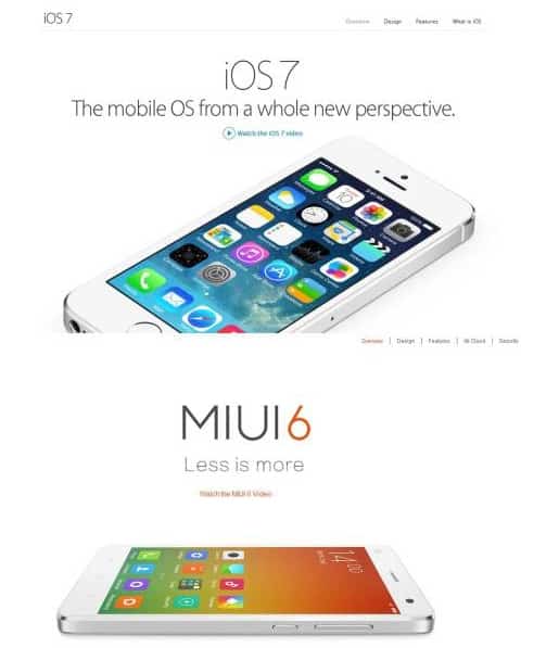
Xiaomi has released its new customized user interface for the Mi series. Xiaomi MIUI 7 is the name. Moreover, Xiaomi has announced a global release for this interface. It seems the Chinese mobile maker wants the world to get access to its interface as soon as possible. Since the more people use it, the more popular Xiaomi will be. However, is the MIUI 7 really a genuine product? Many people have claimed that the MIUI 6 looks like it has snatched some feature of iOS7. Therefore, we doubt that the MIUI will be something completely made from scratch. Let us find out more in this article.
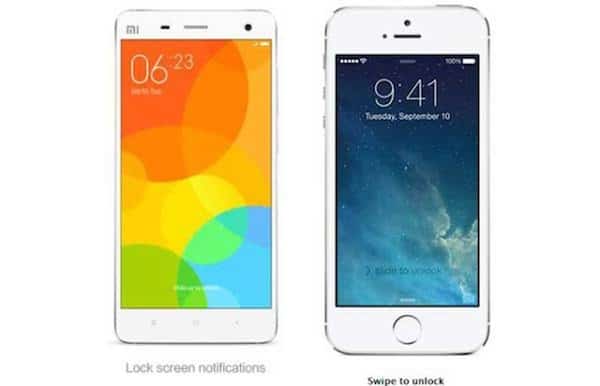
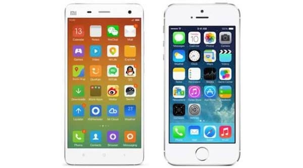
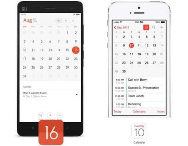
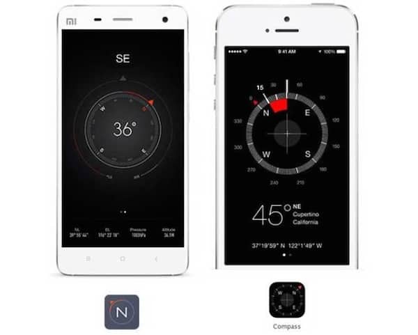
When we place the interface of iOS7 alongside the famous MIUI 6, significantly similar features are spotted. Can you find out below?
MIUI 6 vs iOS7
Slide to unlock, of course
What date is it, again?
Oh, useful compass sensor
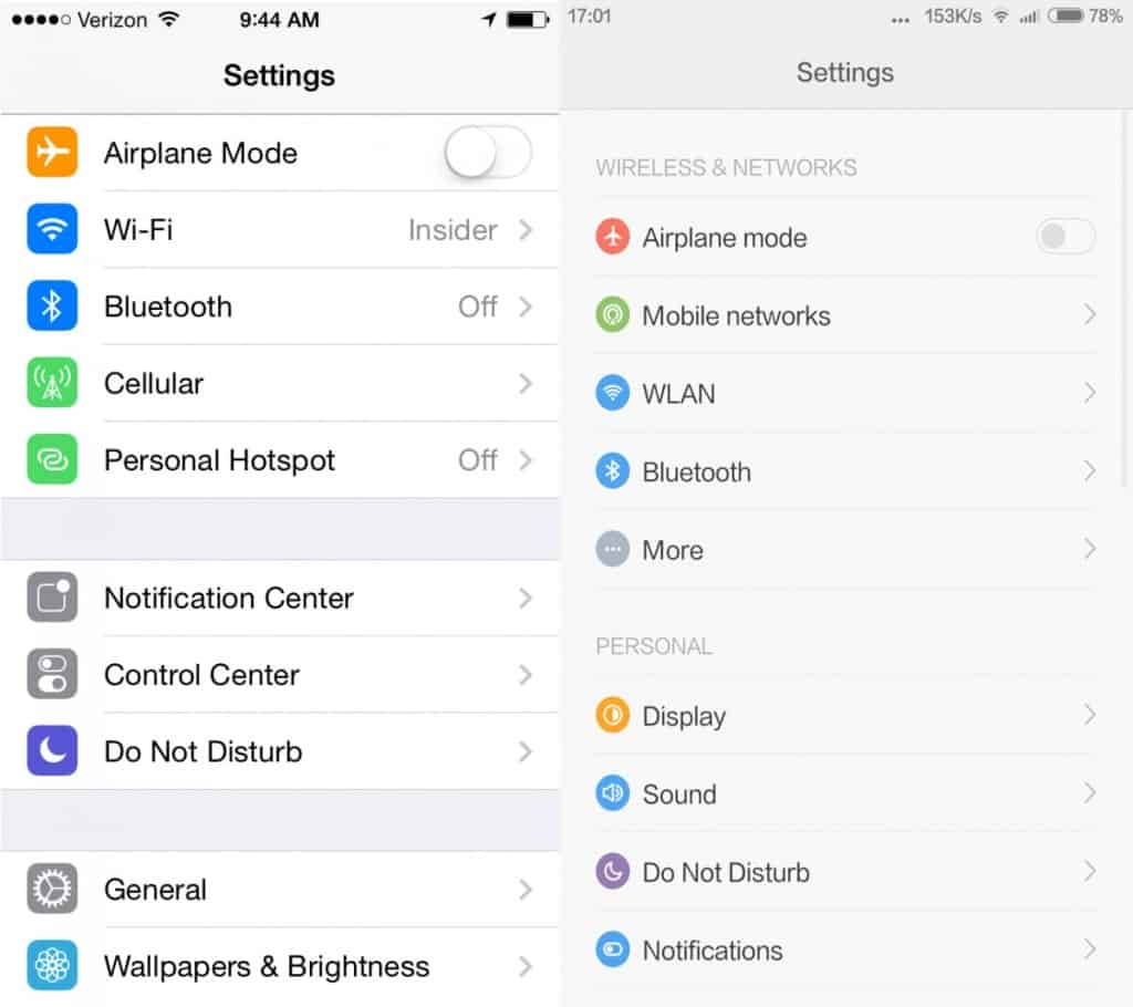
Settings, with iOS7 on the left
After looking at the comparison photos, we can conclude that Xiaomi takes way too many features from iOS7 for their own muse. Even the icons are identical. Of course, inspiration is essential, but it seems not much innovation is there. It seems not only phone design, Xiaomi is following Apple in interface design too.
