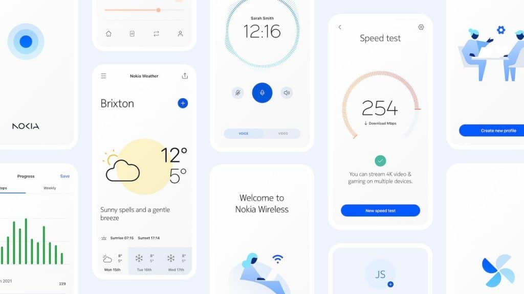
The Finnish brand has just unveiled a brand new interface design language under the name Pure UI. Let’s come find out what this new update will bring for all Nokia users today!

Nokia Pure UI
This month, Nokia finally revealed what they have been working on these past months: Pure UI. According to their website, this new user interface is coming with its B2B and enterprise products in the future. However, the team also confirmed that it wouldn’t apply to all HMD Global’s Nokia handsets. The new UI looks to be a minimalist and clean design. Moreover, it prioritizes easy usage with a distinct appearance.
Overall, the new UI now looks more consistent with multiple components. So far, the brand has shared a guideline on its website with many templates. From what we have seen, the Nokia Pure typeface is a major part of the new look.
The Nokia Pure typeface
Along with the new design, the Nokia Design team also updates their icons. The new art includes more strokes with different thicknesses to match the main display of every device. Once used, you will feel that the animations will run smoothly. The geometric shapes also help to maintain a consistent-looking screen. Additionally, the Pure UI now supports dark mode, in which elements and icons will adjust accordingly.
Suitable for all displays
As mentioned above, all its new components will come in handy for all building complex web-based dashboards. The team has designed it to scale, from large wall-mounted panels to even tiny wrist-worn displays device.